MSMP
Introducing Mo’ Scrolling Mo’ Problems—highlighting the impact of social media on well-being through data-driven insights and engaging visual storytelling.
The site features interactive graphs, animations, and actionable solutions that clearly illustrate how social media habits affect mental health and overall well-being.
Targeted at Millennials, it raises awareness and encourages healthier digital behaviours by blending statistical research with user-centered design to inspire positive change.
-
✓ Performed primary research
✓ Analysed and synthesised data into meaningful and actionable insights
✓ identified design problem through insights gathered from user research
✓ Created low to high fidelity prototypes and wireframes
✓ Conducted usability testing for refinement
✓ Designed final high-fidelity prototype
✓ Presented updates and final value proposition
-
✓ The project must involve designing a website from scratch, incorporating low, mid, and high-fidelity iterations, with refinements guided by usability testing.
✓ Decisions should be backed by thorough research to effectively communicate a compelling story.
✓ The design must be data-driven, with information presented in a visually appealing manner by integrating CSV files into the code using the Plotly JavaScript Library.
-
✓ Visual Studio Code
✓ Figma
✓ Canva
✓ Typeform
✓ Google Forms
-
✓ Programming
✓ HTML
✓ CSS
✓ Javascript
✓ User Research
✓ Iterative Design
✓ Presentation
✓ Prototyping
✓ User-centered Design
✓ Information Architecture
✓ Interaction Design
✓ Wire-framing
✓ Visual Design
✓ Accessibility Design
✓ Thematic Analysis
✓ Data Analysis
✓ Customer Journey Mapping
-
✓ 6 months
Insights
Data was gathered from recent studies and surveys on social media usage, its impact on mental health, and user behaviours, revealing alarming key insights.
-
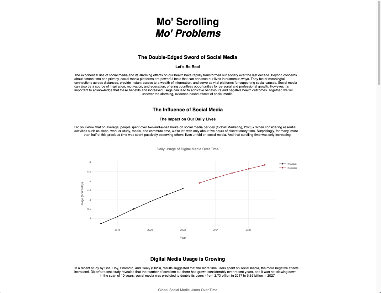
The average person spends over 2.5 hours per day on social media platforms. When considering essential activities such as sleep, work or study, meals, and commute time, we're left with only about 5 hours of discretionary time. Surprisingly, for many, more than half of this precious time is spent passively observing others' lives unfold on social media.
And that scrolling time is only increasing. But what are the consequences of this incessant scrolling, liking, and sharing?
It's not just a matter of lost time—it's about the toll it takes on our mental health.
-
In a recent study, results showed that the negative effects increased with more time spent on social media.
-
There is a significant connection between heavy social media usage and increased rates of anxiety, depression, loneliness, self-harm and suicidal thoughts.
-
Social media platforms stimulate the brain to release dopamine (the “feel good hormone”), encouraging repeated engagement.
Interactions such as shares, likes, and comments activate the brain's reward system, eliciting a sensation resembling the highs experienced during gambling or drug use.
-
Excessive social media usage can create a negative, self-perpetuating cycle: Social media usage is increased as a means to alleviate boredom, loneliness, depression, anxiety and stress. Frequent scrolling exacerbates feelings of FOMO, and lead to sensations of inadequacy, discontentment, and isolation.
As a result, these emotions have a detrimental impact on ones mood, enhancing the initial symptoms—and the cycle continues
The Problem
Valuable insights on the negative effects of social media are buried in dense, mundane research papers, limiting users' ability to access and understand them.
Concept
The design brief required me to create a website that tells a compelling, data-driven story about social media's impact. The MSMP website uses statistical research to reveal the often-overlooked negative effects of social media.
I envisioned a site that not only visualised these negative effects in an engaging way but also provided clear strategies for users to make positive changes and develop healthier online habits.
I utilised recent studies, surveys on social media use, mental health research, and user behaviour patterns to inform design decisions.
Ideation
Research revealed that Millennials (ages 24-42), the most active demographic on social media, are increasingly concerned about its effects on their well-being. To address this, I developed an effective site narrative:
Introduction to social media with stats on daily usage
Positive aspects like connectivity and access to information
Negative impacts, including mental health correlations
Consequences of excessive "scrolling" with detailed health insights
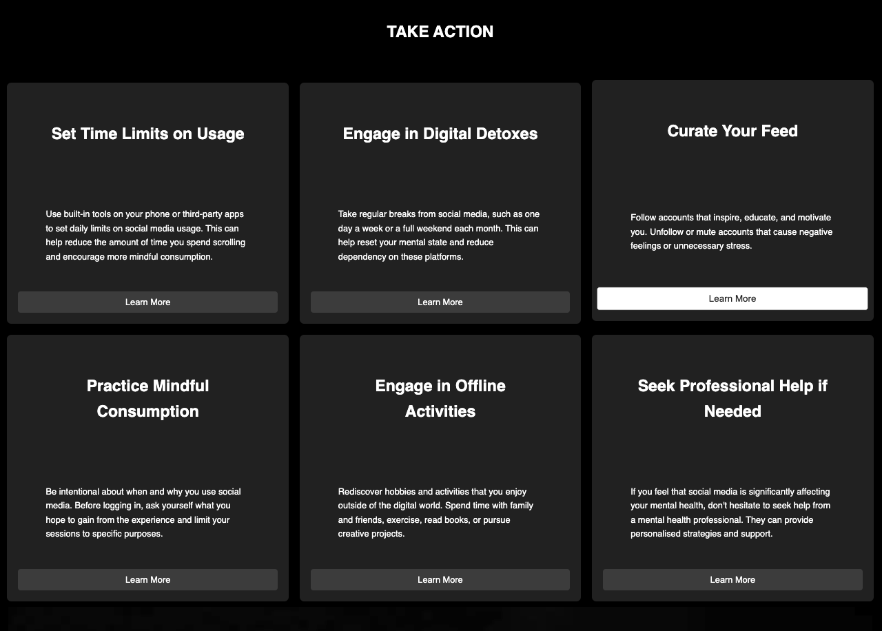
Practical strategies for healthier habits
The website leverages research-backed data and interactive visualisations to inspire users to adopt healthier social media habits, ultimately improving their well-being.
-
I gathered data from reputable sources focusing on recent studies and surveys to ensure the information remained relevant to users.
-
In CSV files, I removed inconsistencies and missing values, standardising formats to ensure it embedded smoothly into my code.
-
I analysed patterns and correlations within the data, translating them into actionable insights, while also accounting for outliers and their potential impact on skewing the results.
-
I mapped data to unique graph styles that best communicate information in an engaging and concise way.
For example, social media usage varied significantly across global regions, which was then visually represented on the choropleth map through colour gradients and hover labels.
Data-Mapping Strategy
I employed unique web elements to enhance user engagement and interactivity in presenting statistics, including a choropleth world map. This map visualises geographical patterns, allowing users to scroll through a 3D globe and explore data by hovering over regions for detailed insights. The color gradient further communicates information, with darker shades representing higher usage, enabling users to quickly interpret regional differences and understand potential influences on social media behaviour.
To create accurate and effective visualisations, I followed the following steps:
Prototype, Iterate, Repeat
Iteration 1: Low-Fidelity Wireframes
Below are comparisons of the two iterations I created using Figma, prior to starting the programming process in Visual Studio Code. This step was taken to ensure the layout was optimised for efficiency during coding.


Iteration 2: Mid-Fidelity Sites
Shown are two mid-fidelity iterations programmed using Visual Studio Code (HTML, CSS, and JavaScript) in preparation for usability testing.


Usability Testing
Initially, I planned to conduct semi-structured interviews to delve deeper into participants' insights. However, this approach was streamlined due to unforeseen time constraints and scheduling issues while ensuring I gained qualitative feedback to refine my prototype.
Consequently, the user testing protocol evolved into two key phases:
Interaction with the website prototype based on predefined goals
Post-interaction qualitative survey to measure usability & gather feedback
To overcome scheduling conflicts, I opted for a virtual survey which allowed participants to engage with the test at their convenience. This approach also facilitated easy sharing of the survey, ensuring a smooth user-testing experience for both participants and myself.
Eight users were recruited, each assigned a specific goal to frame their interaction with the prototype. The post-interaction survey began by assessing goal achievement, followed by inquiries about their overall experience, usability, design, functionality, content relevance, user interaction, performance, satisfaction, areas for improvement, and final reflections.
Tutor feedback on my assignment highlighted concerns regarding data sourcing feasibility and graph comprehension. It became evident during the presentation that not all intended data had been acquired, raising feasibility concerns. For example, the comparison of dopamine level impacts between social media usage and drug use posed challenges due to data reliability and availability. As a result, I opted to simplify my concept in response to this feedback.
After consolidating user testing data through an Affinity Diagram analysis, eight actionable statements were derived to refine the prototype:
Findings: 8 Actionable Statements for Refinement
-
Clarify Functionality Instructions
Provide clear instructions for website functions to enhance user experience.
-
Improve Graph Info Clarity
Ensure all graphs and visual elements are clearly labelled for easy comprehension.
-
Enhance Design Consistency
Maintain consistency in design elements for improved visual appeal.
-
Optimise Content Relevance
Ensure all content remains relevant to the website's purpose to maintain user engagement.
-
Improve Text-Image Integration
Enhance integration between text and images for a cohesive layout.
-
Highlight Key Information
Use visual cues to highlight important information and guide user attention effectively.
-
Enhance Interactive Element
Improve functionality of interactive elements to enhance user interaction.
-
Simplify Design Elements
Maintain simplicity in design while effectively conveying information and engaging users.
Final Concept
The final concept underwent refinements to ensure clarity and engagement after incorporating feedback from the initial presentation and user testing insights. Key changes addressing the actionable statements include:
Shortened Paragraph Reading Path
Utilised divs to streamline the paragraph reading path, enhancing visual appeal and information structure
Images
Introduced new images to enhance the website's visual impact and break up textual content, ensuring a spacious layout.
Animation
Implemented a fade-in animation using JavaScript to enhance the website's dramatic tone. Hover animations were introduced for the CTA’s to make each container grow and each button change colour.
Colour
Changed background colour to black to highlight graphs with red accents, creating a cohesive user experience. Increased contrast between colours to ensure the site meets accessibility standards
Enhanced Graph Labels
Adjusted graph label colours for contrast and adherence to accessibility standards. Improved legibility of labels and re-defined them to ensure their clarity
These refinements aim to deliver a polished and engaging user experience, addressing feedback points while maintaining project objectives.


